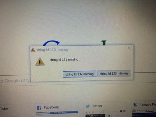
This error has ended up being rather mysterious…
...I like Google Drive, and use it pretty much every day. I’ve found it fairly simple, pared-back, and convenient.
...I’ve just got back from speaking at Write the Docs, and I had a fantastic time. Thanks so much to everyone for your kind words about my talk - I’m so chuffed you all liked it.
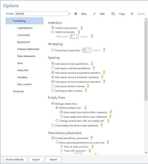
...Just a quick one today, from ApexSQL Refactor:

There is no way all those options need help widgets. I actually think their option text is reasonably clear, so they can just leave it at that. What more is there to say about, I don’t know, “Add spaces after commas”?
...Slightly outside the normal remit here; I’ve just been looking at Atlassian’s redesigned website.
...In my last team, we worked on a piece of software that could send you email notifications, but you needed to use your own SMTP server.
...Post #2 about Skype for Business. In this post, I’m going through the writing of the introductory tour in detail.
...At work I used Lync, Microsoft’s instant messenger, until it upgraded itself to Skype for Business yesterday. Not only is the introduction terribly overwritten, but the online content is dreadful too. So this is the first in a series of blog post about what Skype and Skype for Business are doing wrong.
...I’m trying out Inbox by Gmail, and I like the simplicity of it so far. The popups are a nice use of example content to make the the introduction to the UI make much more sense.
...