In my last team, we worked on a piece of software that could send you email notifications, but you needed to use your own SMTP server.
The first iteration of the feature sent you a confirmation message when you set up email, but that was it. If the confirmation email didn’t get through, you wouldn’t have a clue why.
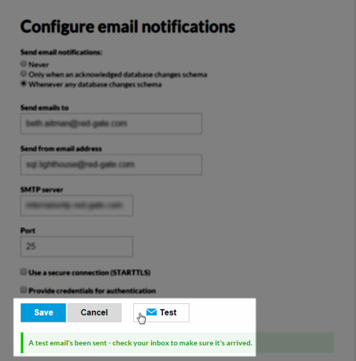
So when we got more time to work on it, we added a Send test email feature:

When the test email didn’t come through, we displayed an error, which came from the SMTP server:

This helped people a bit - they could see when their email settings weren’t right. But the messages we got from the sever ranged from the helpful to the completely cryptic. So I decided to see if I could improve them.
We collected data on the errors people were hitting, and found that there were about 20 reasonably common ones. I went through the 20, found out what they meant, and worked out a human-readable version. Crucially, I included a suggestion for what you needed to do to fix the error:

These were much better, and helped a bunch of people set up email notifications - a lot of them had made a mistake entering their details, or weren’t using a secure connection when they needed to.
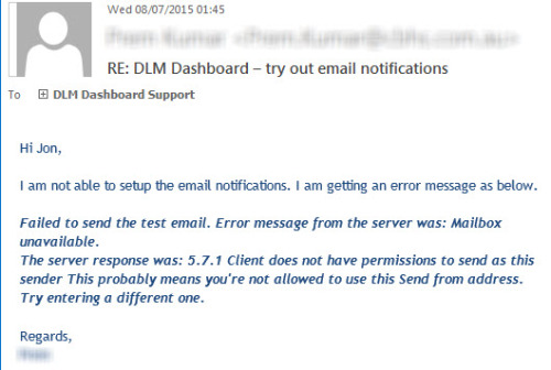
Still not great though. Can you guess what the problem was?

Frankly, the messages are just too long. This customer (and probably others) hadn’t spotted my little explanation of what he needed to do, because it was in a wall of text.
It’s a real dilemma. For some of the errors we could be sure “This is definitely the fix”, but for others we could only say “This is probably what’s wrong”. So we couldn’t hide the server messages altogether: their sysadmin might need the full thing to diagnose the problem.
This is still where it’s at right now. I don’t think it’s awful: I think here it’s better to include the helpful information, even if it makes it long.
A possible improvement would be to hide the server message when we definitely know what the problem is, and surface it otherwise.
Alternatively, we could visually distinguish the server errors from the readable solution. But that’s technically difficult with the setup we have now.
But I think the moral of the story is that it’s better to add useful information (but a bit of clutter) than to leave people baffled. It’s a difficult balance though.