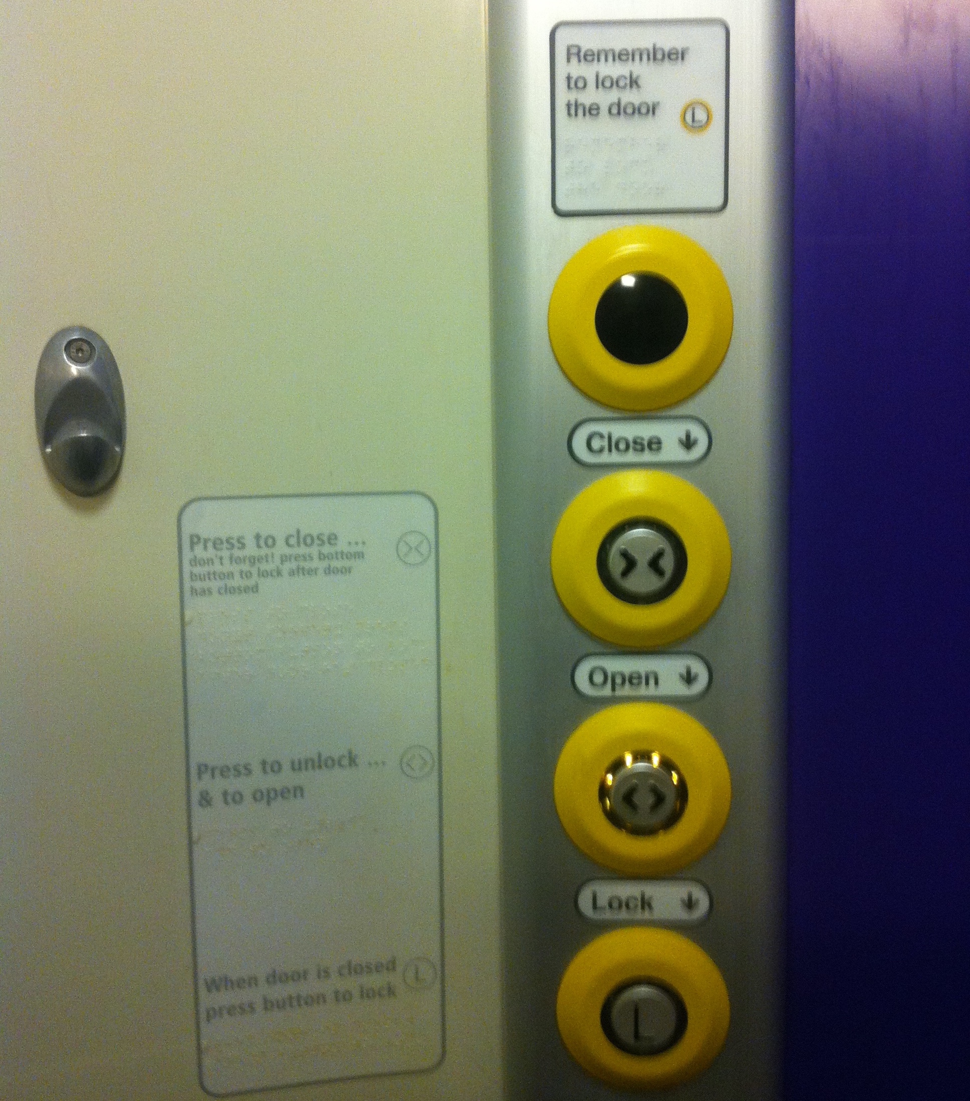
This door from a train toilet is a great example of adding lots of information in an attempt to fix bad UI design.

What’s wrong with this design? #
Usually, the way you interact with a door is signalled by cues on the door itself - for example a handle to open it, a bolt to shut. When these perceived affordances of how to use a door are obvious, you don’t need to add any words to explain how to use it. (Of course, badly designed doors are everywhere.)
For this door, instead of interacting with the door itself, you interact with these buttons. They’re labelled badly with unclear icons. (Icons are almost never as clear as you think they are, but that’s a rant for another day.)
You can tell they’re bad because the design had to add words on top of the icons to explain what they mean. And then also arrows next to the words, because the labels were badly placed, making it unclear which button the labels were for.
But even that isn’t enough to explain how to use this door.
The design itself communicates poorly #
When you push the “Close” button, it’s not obvious that you need to do something else as well in order for the door to lock. (Which is reasonably important in a toilet door.)
You can tell this has been a problem - there are three separate places where extra text asks you not to forget to push the “Lock” button. There’s piles of information around this design, trying to help people to use it successfully.
Telling isn’t the right solution #
The door design fails to make it obvious what its users need to do, and adding signs off to the side doesn’t help. Many won’t notice the signs because it’s not where their attention is at the time - they literally won’t see the text telling them what to do.
What’s needed is a design that guides users towards what they need to do, or even better, does it for them. It needs obvious signalling. Clear communication. Understanding of how people behave, and anticipation of what they’ll do.
When the problem is “people aren’t using this design as intended”, the solution isn’t “tell them to use it properly”. It’s “make a better design”.