
A page for logging in isn’t a complex idea, but often they’re overdone, overcomplicated, or confusing. So I wanted to call out a nice example with decent writing, from Trello:
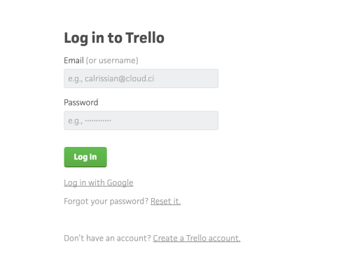
Good things here:
- A clear title, reminding you where you are and what’s happening.
- Straightforward labels. Looking out for users who want to log in with a username, not an email.
- Good placeholder text reinforcing what goes in the fields. But it keeps labels outside the field too, so users don’t have to rely on it.
- A clear, primary call to action. (I wish they’d used sentence case, ie “Log in”, but you can’t have everything!)
- The secondary options are still here, obvious but unobtrusive. They’re cleanly and concisely phrased, targeting users with questions and giving them clearly phrased actions to follow up with.
I also liked the error message I got when I tried to log in:
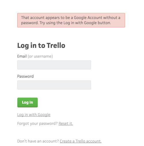
For me, it’s a great example along the lines of the Voice & Tone guidelines on errors: it’s calm, serious and straightforward, and offers a next step. It shows you don’t need to be formal, stuffy or alarming in error messages. And actually, I’d argue that a conversational (if serious) tone here is exactly what a user needs in an error case.
I like the contents of the message: the information it gave me about what was wrong guided me towards what I needed to do next, and helped me understand. Not everyone agrees, and it’s true that it goes into possibly unnecessary detail about the implementation of Google account authentication.
An alternative, rephrasing the detail so it’s relevant to the user, is “You signed up with a Google Account, so you can’t log in with a password. Try using the Log in with Google button.”
What would be super nice is if the message itself contained a link to the “Log in with Google” page - so you don’t have to look around the page to find the link. But as the page is so minimal, it’s not too much of a problem.