
One of our developers was trying to make it easier for our colleagues to keep updated on a pull request (PR)’s status, after they’ve reviewed it. This developer was building a Slack bot to do this. I offered to help - it seemed like an interesting information design problem.
Their initial design #
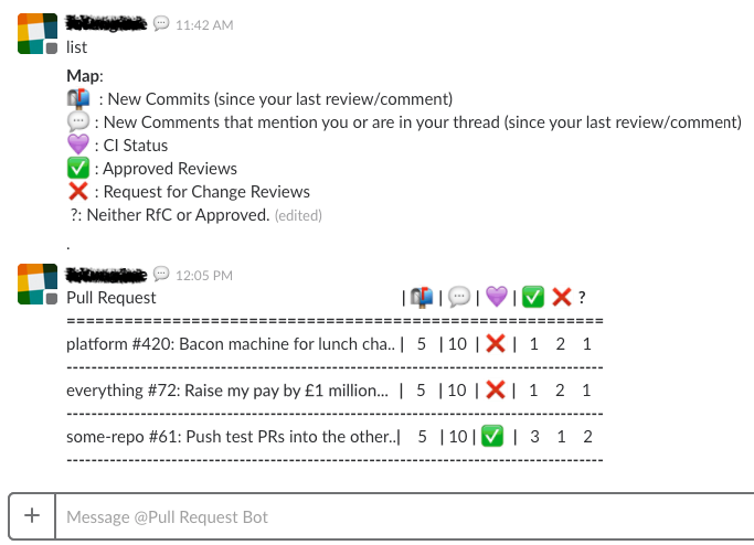
This isn’t ideal. It needs a legend to explain what all the symbols mean: the concepts they’re trying to communicate are not simple, and just can’t be summed up neatly by an icon. It’s also hard to get information out of this at a glance.
It turned out that our developer assumed they needed to use a table - and because they were using a table, they had to use emoji-only headers, otherwise it wouldn’t fit horizontally.
(For those not familiar with Git and GitHub: the first bit in the pull request column (eg “platform”, “everything”) is the name of the code repository; the number is the ID of the pull request; and the rest is the pull request’s title.)
A quick fix #
Firstly, I had a go at a minimal redesign. I felt like the table was causing problems, so I tried to find a different format for the information:
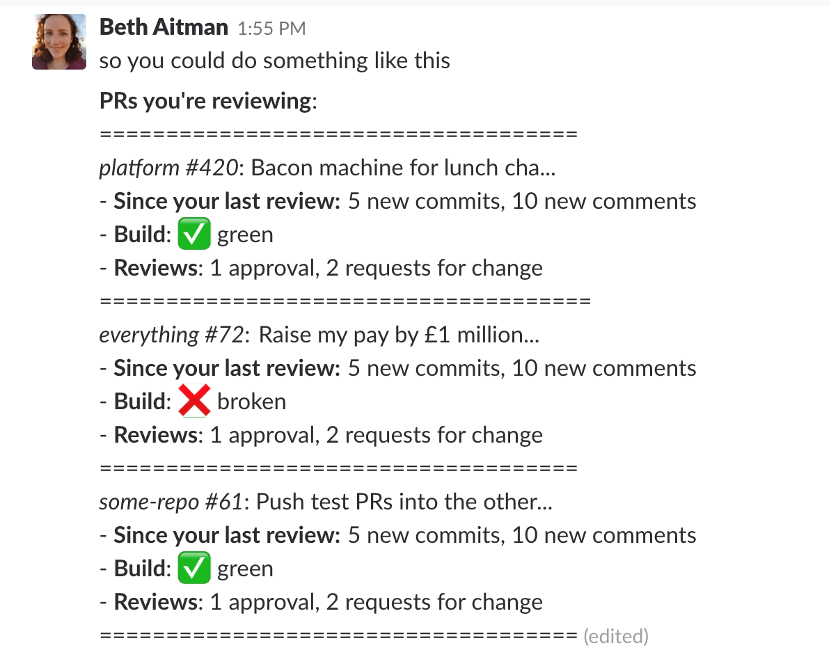
I wanted to do something that would be low effort to implement, making it really easy for our developer to improve the information design. It can be done totally with text and basic markup: doesn’t need any fanciness to implement.
I also wanted to keep some elements of their design. A total redesign can come across as harsh criticism, and I was basically rewriting all the text they wrote. So I kept some of the clearer emojis, and some of the structure (using = signs for the dividers).
This redesign takes up more space than the original. But that’s fine! Conciseness is important, but clarity has to win out. This design doesn’t require a legend, because it uses clear text labels to replace most of the emojis. It uses phrases (eg “5 new commits”) rather than numbers in a table.
And the whole thing is much more readable. The users of this bot are trying to find out what’s changed since their last review, so they know what they need to do. This design focuses on efficiently getting them that information.
Something a bit fancier #
Then I discovered attachments! This was pretty exciting, because you can use them to format bot messages in a much nicer way.
I actually really enjoyed using Slack’s documentation around these:
- The Introduction to messages gives an overview of what’s possible with messages and attachments, and also gives a sense of what the features are for.
- There are some helpful Guidelines for building messages that look more at the UX side, and what best practice looks like - particularly if you’re implementing a more complicated workflow.
- The page on Attachments is what helped me understand the range of possibilities of the format.
But my favourite bit was the Message builder. It lets you really quickly prototype a message (including attachments), refreshing whenever you make a change so you can see the effect. I had a lot of fun playing around with it, it’s a great tool.
I ended up with this:
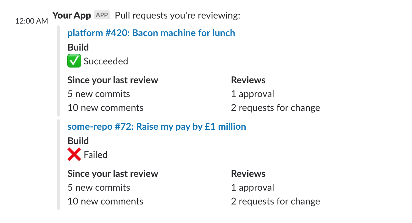
Just using the built-in formatting options means we could create something that was much easier on the eye. It has a few other improvements too:
- The heading is now a link to the PR, which is obviously useful.
- I moved the “build” section earlier - because if the build is failing, users probably won’t need to re-review the PR yet. An example of failing users faster.
- Using the “short” format for fields lets it make better use of the horizontal space.
In the abstract, I think this is pretty decent now. The next step would be user testing - seeing whether we’re actually including the right information here, and checking which bits matter the most to users.