Post #2 about Skype for Business. In this post, I’m going through the writing of the introductory tour in detail.
As I’ve said before, 7 topics is far too many: it’s too much for people to hold in their mind. I think the reason there are so many (related to that slightly odd “tips most people ask for”) is the classic Microsoft problem of providing a lot of features, but making them so hard to find that nobody knows they exist.
I’m not keen on the phrasing of the subtitle, mostly because it doesn’t describe very well what this is. It’s more “Let’s see what you can do with Skype for Business”: an introduction to the features.
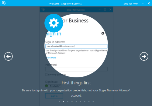
Tip 1. It’s worrying they feel the need to tell you here which account to use. As you can see the embedded help telling you the same, it implies that embedded help hasn’t been able to get people to use the right account.
The UI is already looking far more complicated than a simple sign-in form needs to be.
Also, what’s that big cog icon supposed to mean?
I don’t mind “First things first” though. It gives the context nicely, and it’s informal but not overly friendly. It’s a shame it doesn’t stay at that level.
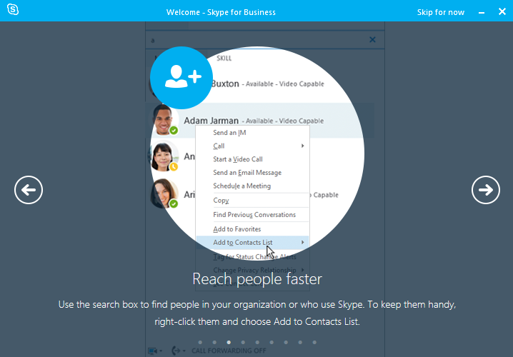
Tip 2. Reach people faster than what?
The way they’ve highlighted the UI crops out the search box they mention, which makes it hard to see what’s going on. “To keep them handy” - what are the actual benefits of adding people to the Contacts List?
I’m not convinced you need to say that the search box in a messaging application can be used to find contacts. It should be obvious, and if it’s not, the placeholder text in the search box gives you the same information but at the point of need.
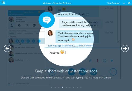
Tip 3. The “Keep it short bit”, funnily enough, could be removed - it’s not adding anything.
I really object to “Yes, it’s really that simple”. Is sending a message ever more complicated than that? It hardly seems something to show off about.
They’ve added the sentence to make it friendlier, but it’s just pointless filler.
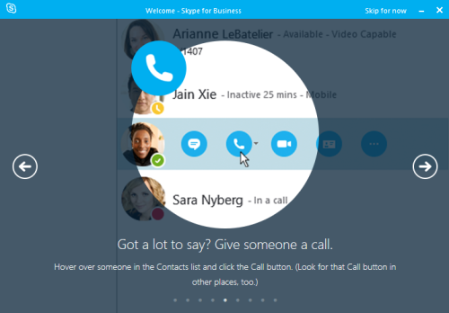
Tip 4. “Got a lot to say” is an oddly judgmental way to phrase it.
“Look for that Call button in other places”: where? Why? Of all the baffling icons in Skype, the Call one definitely isn’t one, so I’m not sure why you’d call this out as an important thing to identify.
It’s fair enough to mention the on-hover behaviour, though, as it’s subtle and easy to miss. (Alternatively, they could have made it more discoverable.)
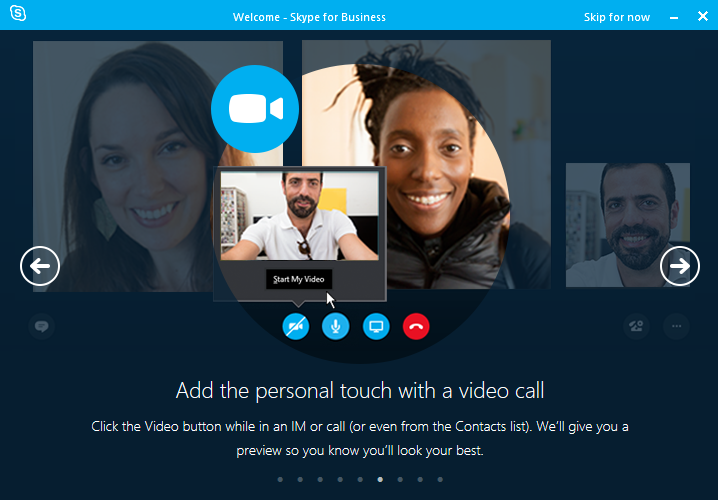
Tip 5. This one’s particularly over-friendly. “So you know you’ll look your best”: this is a business call, not a date! “Preview” is an odd way to describe it too, and doesn’t clearly explain that you can see yourself.
“or even from the Contacts list” is a reminder of how many different ways there are to do one task in Skype for Business. Maybe a topic for another post.
On that point, this doesn’t seem to tell you about the most likely path. I’d have thought you usually to start a video call as a video call, rather than start calling and then start video. But maybe they know better than me.
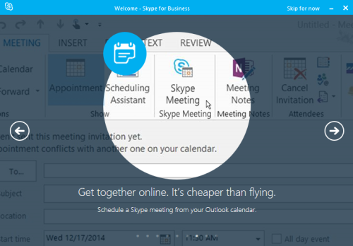
Tip 6. Just makes me roll my eyes.
The headline’s not good. This is potentially a useful feature, and the headline doesn’t make clear what it is - you have to read the small subtitle text. Mentioning the word “meeting” in the headline, for example, could be an improvement.
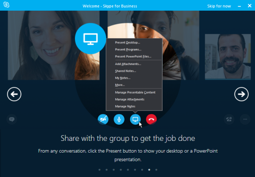
Tip 7. Again, a poor headline that gives you no idea what the feature is. “To get the job done” is entirely filler.
Useful screenshot though, for another hidden feature that I wouldn’t know existed.
And we’re done. Phew.