At work I used Lync, Microsoft’s instant messenger, until it upgraded itself to Skype for Business yesterday. Not only is the introduction terribly overwritten, but the online content is dreadful too. So this is the first in a series of blog post about what Skype and Skype for Business are doing wrong.
To start it off, I want to point out the complexity of the introductory tour. 7 is way too many things to go through - nobody’s going to remember all of them.
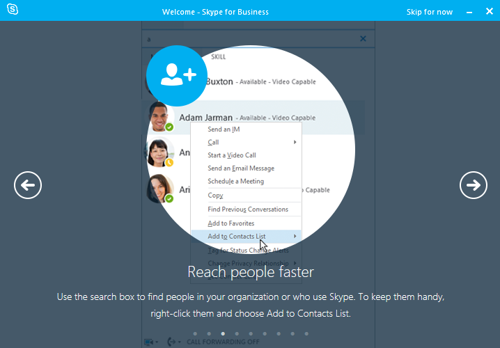

Almost all of the text is overdone (I’ll go into more detail about this later). They could say the same thing, much more effectively and simply, and without that pally voice they’re using.
It’s interesting to compare these to the Inbox introductory tour, because one of the things that stands out is the difference in complexity of the UI. Inbox’s tour is obviously much more pared-down, partially because the app’s already simple. The number of things it covers is smaller, and it describes them in a simpler way.

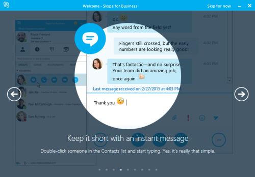
Skype for Business is trying to cut down on how complex it looks by highlighting a single bit of relevant UI. But the amount of stuff there is to deal with makes this incredibly hard. Compare that to Inbox. It does the same thing by blurring out irrelevant rows, but it hasn’t actually had to cut down the user interface at all - because its UI is pretty straightforward.
I’ll go through in detail about the writing style and what’s wrong with it in my next post. For now, the main point I want to make is this. If your product is complicated, it’s hard to introduce people to simply. Make the product simple, and the writing is much easier.