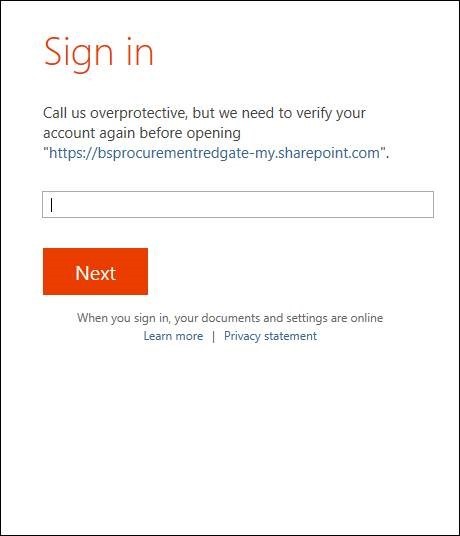
This is a Microsoft sign in page. Yeah.

Microsoft have been trying to move away from speaking robotically, but this is too far in the other direction. It’s all in the “Call us overprotective”: they’re a multi-national company who don’t have a very cool or friendly image. Overprotective is something you’d call your mum.
It might work for a company with a different image, but because it’s Microsoft, it’s like a strange man in a suit coming up and trying to hug you. It’s weird for a faceless organisation to speak like it’s one of your mates.
Worst of all, this page doesn’t tell you what’s supposed to go in the field. Your account name? Your email address?
The fix #
Instead of the over-intimate “Call us overprotective”, add some actual information on what you have to enter.