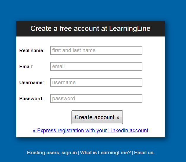
The sign-up form for LearningLine, an online learning platform.

Overall, it’s functional but badly written. Problems:
- Useless placeholder text that adds no extra information
- The French quotation marks used to imply forward and backward
- The random links beneath the form are very strange.
- If that’s a call to action, it should be “Sign in”.
- The second one’s just a link to the site home page, not sure what that’s supposed to help with.
- Email us does exactly what it says on the tin - opens an email to them - but it’s not at all clear why you’d want to do that.
Even better, if you don’t enter a name in the Real name field, and then hover over the field, you get this gem:

a) that’s a really undiscoverable way of giving error information. b) which is it supposed to be? First name? Full name? What?