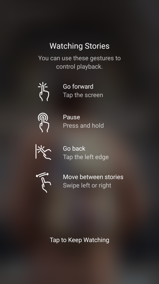
I came across this the other day when looking at Stories on Instagram (photos that play like a slideshow, and disappear after 24 hours). Stories take up the whole of your screen, and don’t have any obvious controls, so it can be a bit hard to work out what you can do, apart from sit there and watch the photos progress.
And there are actually a bunch of gestures you can use to interact with them - which, like many gesture-based controls, are very hard to discover.
So when this screen popped up when I opened a story the other day, I really appreciated it.

What makes this good help? #
- It’s at the point of need: I can see this and then immediately try out the features.
- It combines visuals and text for clearer explanations: it’s not always obvious what the words used to describe gestures mean, so this reinforces the meaning.
- It’s short and sweet: uses simple language and clear descriptions.
Any problems? #
There’s no way to come back to this help - that I could see, anyway. Once you’ve tapped away, it’s gone. So you have to remember what you see on this screen.
So this screen helps a bit with the discoverability problem - but it’s a one-time intervention that doesn’t solve it entirely.