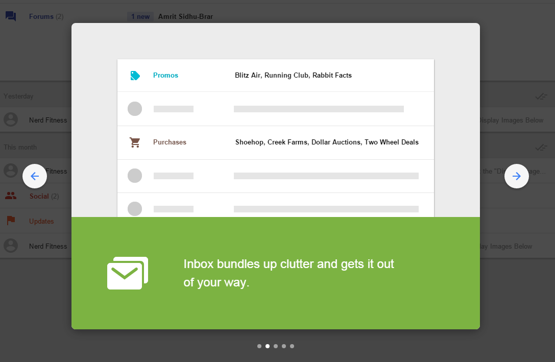
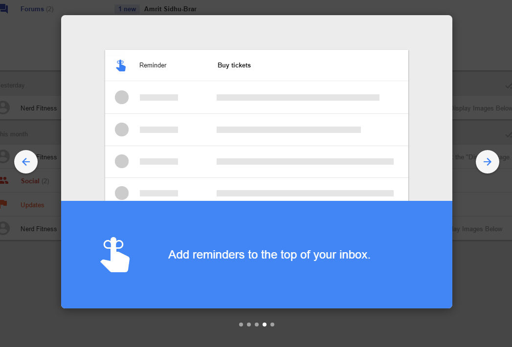
I’m trying out Inbox by Gmail, and I like the simplicity of it so far. The popups are a nice use of example content to make the the introduction to the UI make much more sense.
Screenshots are really useful when they use good examples that make how you’d use something much clearer. It’s nice to have ideas of how to use an application too.


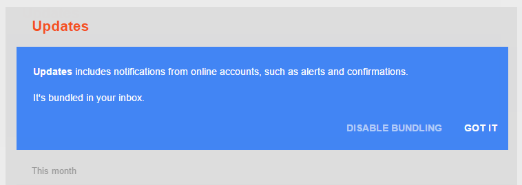
I like the explanation of bundling things together, and the two possible actions - “got it” seems good as an alternative to “ok”.
The only problem is that this message comes up for every bundle. It feels like, if you’ve said you understood it, you don’t need to see the message again; so you don’t notice the differences between the messages, which explain what the different bundles do.
It wouldn’t be so bad if they made them visually more distinct (eg by putting ‘it’s bundled in your inbox’ onto the same line as the first sentence) to make it look less like a repeated message.