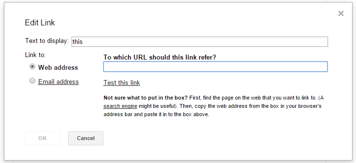
If you add a link in Gmail, you get this dialog:

It’s odd, because in general Gmail’s nicely done and pretty pared-back. I wonder if they’ve forgotten this existed.
The problems #
The main issue is too much text and explanation, when it’s not needed. Pretty much everyone understands how links work. If they don’t, they’ll struggle with the rest of Gmail too, so they’re not the target audience anyway.
“To which URL should this link refer” is ridiculous phrasing, and you don’t need that there at all. “Web address” in front of the field explains what the field’s for just fine.
As for the help text at the bottom: who decides to add a link without knowing what the link they want to add is? The phrasing’s bad here too: “copy the web address from the box in your browser’s address bar” could be “copy the address from your browser’s address bar”. But if you know what an address bar is, you probably wouldn’t need help with links in the first place.
It’s not clear when you’d want to test a link, either.
The fix #
Basically delete everything that’s not totally necessary. Something like this:

It’s straightfoward, a little stark, but who wants to linger on a link dialog?