
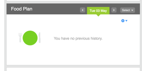
Today’s post prompted by this helpful piece of copy from Fitbit:
Why are empty states important? #
When you’re designing software, you spend most of your time thinking about what it’ll be like when users are interacting with it normally. It’s easy to forget about what it looks like when there’s nothing in it. But that’s often the time users need your help the most, because without any content, it’s hard to work out what something does.
In the Fitbit example above, I have no idea why it’s not showing me anything (and clicking on the gear icon doesn’t give any clues). They haven’t thought very hard about the copy, either about how to explain why there’s nothing here, or what I need to do to add something.
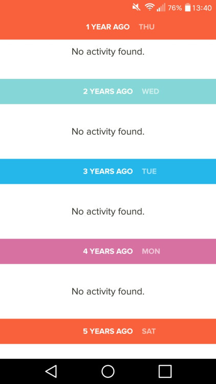
If you’re not careful you can end up with this kind of depressing view, with no idea how to get some content in here (thanks screenshots of despair):
Something better #
For starters, explain what the next steps are, like Google Drive does here:

WhatsApp goes one better, with clearer instructions on finding that button:

Even better, don’t make users go hunting for a button somewhere else - make them part of your empty state (via emptystat.es):
In short:
- Think about what your software looks like when there’s nothing in it
- Work out how your users can make it not empty
- Make it really easy for them to do that