
I came across a few terrible confirmation dialogs/“Are you sure” messages recently, like this one:
As they’re so common, I thought I’d go through some examples, and discuss what works and what doesn’t.
Confirmation dialogs can be useful, in situations when a user chooses to do something that has bad or unexpected consequences. They aim to make sure that the user knows what they’re getting themselves into - or out of.
Is a confirmation dialog the right design solution? #
Be sparing with confirmation dialogs, because they’re only used when you think that the user didn’t really want to do what they just told you they wanted to do. If they did want to do it, and they can easily undo it, a confirmation is just irritating.
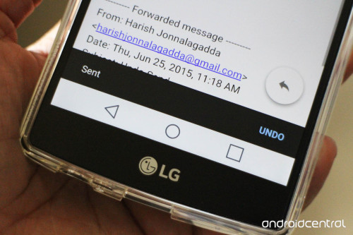
A better alternative is the option to undo an action, allowing a user to easily change their mind. Undoing means you don’t need to second-guess whether your users wanted to do a thing or not. Google apps do this pretty well, even letting you change your mind about sending an email:
But in some cases - particularly for irreversible and damaging actions - they can still be useful. So how do you write one?
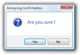
The traditional Windows confirmation #
Here’s an example of a classic confirmation dialog. The user opted to do something potentially damaging, so it checks that they definitely want to:
However, the action here isn’t actually that damaging. It’s not irreversible, like deleting something permanently, as it’s easily fixed by undoing. A confirmation dialog isn’t really needed here.
The wording, “Are you sure you want to do the thing?”, can be cut down. “Do the thing?” is shorter and (usually) just as expressive.
The button options are Yes/No, but using these can make it harder for users to make a decision. They might have to read closely to understand what they’re choosing, like here:
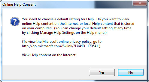
(To be fair, that dialog has bigger problems. The reason it’s unclear is not just that it’s a wall of text, but also that the question doesn’t have a Yes/No answer - it’s “Do you want this thing or that thing?”.)
Making the choice clear #
A confirmation dialog is asking users to choose what they want to do - so you need to make sure that choice is clear. That involves:
- Making sure the user knows what consequences of the choice are
- Reinforcing the choice in the button text
- Clear consequences
The best time to use a confirmation dialog is when the user might not know their actions could have bad consequences. (For example, when deleting a file could stop your computer working properly.) To make an informed choice, they need to understand those consequences.
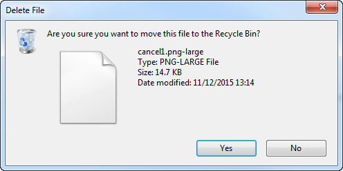
If you don’t make it clear, it’s very difficult to make a decision. Take this example:
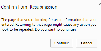
It’s phrased so that it’s not clear what will happen when you choose either of the options. As a user, you don’t know what you should do.
It isn’t easy to make technical information like this simple for users, but it’s worth it - it makes the user experience so much better. In this case, the message could be something like this:
To refresh this page, Chrome needs to resend the information you entered. Any actions you took (like making a payment) might be repeated.
Refresh/Cancel
Focus on the button text #
Be wary of adding lots of explanation in the confirmation message, though. The more you add, the less likely it is to be read. And if you’re writing for mobile, you’ve got very little space to play with anyway.
But if users read nothing else, they’ll look at the buttons. So instead, focus on the button text, because you can use it to make the choice you’re offering clear.
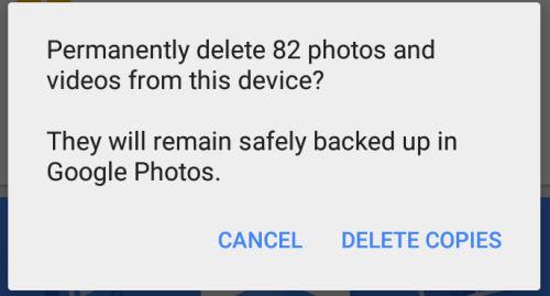
Using Continue/Cancel or Continue/Close is a good pattern for this. You can also go for “Do the thing”/Cancel, as per Google’s Material Design guidelines:
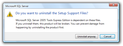
For particularly dangerous actions, you can use the button text to make them hesitate, heavily implying which one the user should choose:
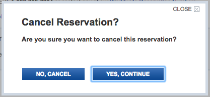
Cancel cancelling? #
Of course, that wording can backfire - when the action itself is cancellation:
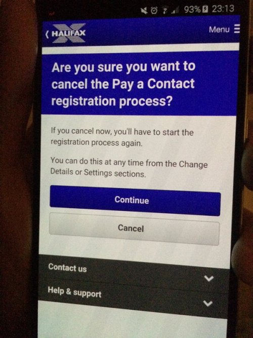
In this case, there are a few better options:
- Replace it with a Yes/No question, eg “Cancel this process? Yes/No”
- Be a bit wordier and more specific, eg “Cancel this process? Yes, cancel process/No, continue with process”
So, to sum up #
- Check your users actually need a confirmation
- Clearly explain what the consequences are
- Write concise button text that makes clear what they’re choosing
(Thanks very much to Philip Guo and Zara Sheldrake for the ‘cancel cancelling’ screenshots!)