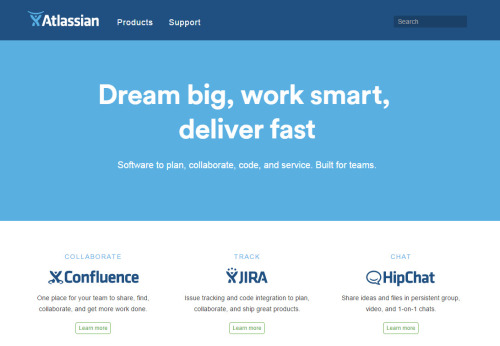
Slightly outside the normal remit here; I’ve just been looking at Atlassian’s redesigned website.

The major thing: I really like the header. With just two sections, it’s simple, clear, and focused on what customers need from the website.
All the other company stuff is tucked away in the footer:

If you click on Products, you get a straightforward, very short summary of what the major products do:

- I think the Bitbucket and Stash summaries are a bit poorer than the others, because they’re not so clear on what the feature they provide is. I guess they could be “Cloud-hosted version control” and “Server-based version control”? But I don’t know enough about the products to be sure.
- The JIRA and HipChat ones are the best, because they’re straightforward summaries of the major features.
- It’s also a bit annoying that the Stash one isn’t on one line, as the rest of them look so neat! But that’s a minor quibble.
- “Buy a product” would be nicer than “Purchase”.
Then there’s the Support section:

- The taglines here are nice too - you could almost call them embedded help. Not everyone will know that documentation = guides, and fewer will know Atlassian’s names for their Q&A or training services.
- I’m less sure about putting “My account” here, as it’s not clear you’d look in a Support section if you just wanted to know your account details.
- “Support for large teams” doesn’t seem quite correct - surely it’s for large companies? - but again, a quibble.
- It’s good they recognise that most people who click on a “Support” link just want to raise a ticket, and make that easily accessible here. It doesn’t stand out though, and might be better as a button than a link.
- I wonder why they didn’t put “Contact support” as one of the main headers - it fits more obviously there. My guess would be that they want to encourage people to explore the other avenues first, to channel them away from support.
(It’s kind of embarrassing to think about my own company’s website header in comparison. Let’s not talk about it.)