
We’ve talked 404 pages before - let’s look at some more! These examples are on a political theme (although slightly out of date, as the election’s been and gone), thanks to Mashable.
Hilary Clinton’s 404 page #
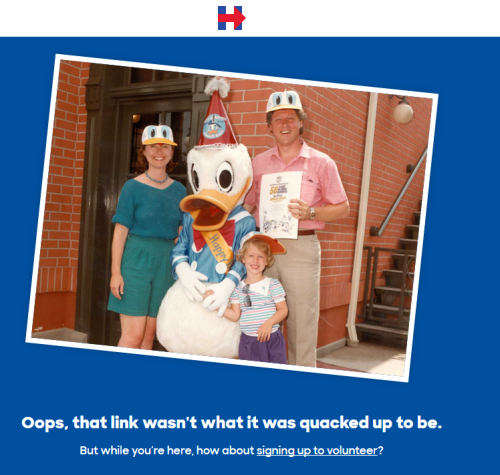
It’s short, it’s funny (but not trying too hard), and it’s reasonably clear it’s a 404 page. It could be more helpful by giving you a search box.
I wonder how effective the volunteering call-to-action is? They’re taking the opportunity, while you’re not doing anything else, to give you something to do.
But I think you probably are in the middle of a task - trying to find the page you were looking for - and I can’t imagine people stay here long.
A Conservative 404 #
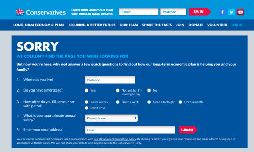
They’re trying to do the same thing as Hilary - catch you while you’re not doing anything. But their attempt is to give you some tailored advertising instead.
Here’s a bit more detail if you can’t read it:
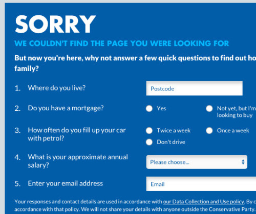
The problem is, because there’s so much content on this page, it’s not very obvious it’s a 404 page. I’d think that people would get confused by the form, as it wasn’t what they were looking for.
Labour’s version #
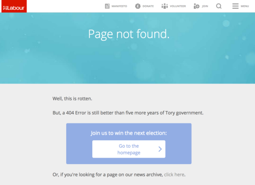
This is a more obvious 404. And they’ve made a reasonable joke - predictable, but at least it’s not trying too hard.
Their call-to-action is a bit confused though. It’s like they wanted to get you to sign up for something, but they forgot to put in a link to do that.
A link to the homepage is reasonable. Not sure how much help the second link is though. “If you’re looking for a specific page, search here”, with a search bar, would be better.
The Lib Dems #
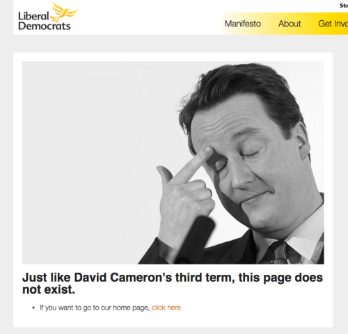
The poor old Lib Dems. They did get trounced. But at least they won the 404 page competition. This is another a not-too-terrible joke, that still makes it clear it’s a 404, and a sensible place to send people.
“Click here” isn’t recommended though - it’s bad for screen readers. “Go to our home page”, all as a link, could be better. (I considered “Go back”, but that’s not true if you’ve followed a broken link from somewhere else.)
A poor showing from the Greens #
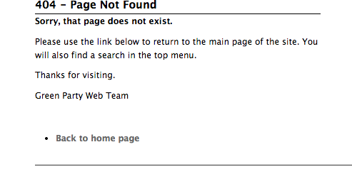
To finish it off, a page that’s making no effort at all. They’ve not even kept the navigation/header from the rest of their site - which, come on, isn’t hard.
“Please use the link below” - oh dear. Why would you explain to people how to use a link, rather than just putting the link there?
“You will also find a search in the top menu” - we wouldn’t need to, if you’d kept the top menu on this page…
They’re trying to be nice with the “Thanks for visiting”, but this isn’t a letter. And it gives the bizarre impression they thought someone wanted to go to this page on purpose.
What makes a good 404 page? #
So what have we learnt from all of these? How can we do better?
A 404 page is ultimately, just an error message. All you need to do is communicate to your user (clearly) that the page they wanted isn’t here, and offer them a way to move on.
That could be by giving them a search box (to find the content they were looking for), or by giving a log-in form (if you have content hidden from anonymous users).
A link to the homepage is common, but I’m not sure how useful that is. If you keep your normal navigation in the header, users should be able to get there easily anyway.
And what about jokes? Loads of websites use 404s as a place to be characterful and funny.
I think it’s fine to be cute, but don’t forget that hitting a 404 can be frustrating, especially if you really needed the page you were trying to get to. Consider Voice&Tone’s guidance on error messages: it’s risky to joke around with people who are stressed.
So it depends on your content - if it could be critical to people, be careful about making your 404 page a big joke. In those political examples, it seems likely that nobody’s relying on their content, so a joke is fine.
Finally - if you’re going to make a cute game or something, don’t forget that you also need to make it clear what the page means!
If anyone has any data on those volunteering calls-to-action, please let me know. I’d love to know how effective they are.